在 Excel 中建立進度條圖
進度條圖是一種條形圖,能以簡潔直觀的視覺效果,協助您輕鬆掌握目標達成的進度。本文將介紹如何在 Excel 中建立進度條圖表。

根據百分比數值建立進度條圖
假設您有以下任務的進度完成率,若要根據此完成百分比建立進度圖表,請依照下列步驟操作:

1. 首先,請計算每個任務的剩餘百分比,輸入公式:=1-B2,接著向下拖曳填滿控制點至其他儲存格,如下圖所示:

2. 接著,選取 A 欄、B 欄與 C 欄中的資料區域,然後點擊插入> 插入直條圖或長條圖> 堆疊長條圖,如下圖所示:

3. 接著,已插入一個堆疊條形圖,您可以刪除圖表標題、格線與圖例等不需要的元素,如下圖所示:
 |  |
4. 接著,以滑鼠右鍵點擊 X 軸,並從快捷選單中選擇設定座標軸,如下圖所示:

5. 在開啟的設定座標軸窗格中,於座標軸選項索引標籤下,將最大值設為 1.0,如下圖所示:

6. 接著,選取圖表中的績效資料長條,點擊格式,並在圖案樣式群組中,挑選符合需求的主題樣式。此處我選擇強烈效果-藍色,讓長條呈現更富立體感的視覺效果,如下圖所示:

7. 您將獲得如下圖所示的圖表:

8. 接著,請格式化剩餘資料長條:以滑鼠右鍵點擊該長條,從快捷選單中選擇設定資料系列。在開啟的設定資料系列窗格中,切換至填滿與線條索引標籤,在填滿區段選取純色填滿,並挑選與績效長條相近的顏色,再依需求調整透明度,如下圖所示:

9. 接下來,請為圖表新增資料標籤:以滑鼠右鍵點擊績效資料長條,並選擇新增資料標籤> 新增資料標籤,如下圖所示:

10. 資料標籤已新增至圖表,接著您可依需求格式化資料標籤,如下圖所示:
 |  |
根據實際值與目標值建立進度條圖
若您有兩欄資料,其中包含目標值與實際值,若要根據這些資料建立進度條圖,請依照下列步驟操作:
1. 請計算目標值與實際值的百分比,於儲存格中輸入公式:=C2/B2,再向下拖曳填滿控制點至其他儲存格。取得結果後,將資料格式化為百分比,如下圖所示:

2. 選取全部資料,然後點擊插入> 插入直條圖或條形圖> 群組長條圖,如下圖所示:

3. 已建立如下圖所示的長條圖:

4. 接著,以滑鼠右鍵點擊目標資料長條,並從快捷選單中選擇設定資料系列,如下圖所示:

5. 在設定資料系列窗格中,於填滿與線條索引標籤下,於填滿區段選取無填滿,並於邊框區段選取實線,再依需求指定邊框顏色,如下圖所示:

6. 接著,點選圖表後,點擊圖表元素,在展開的圖表元素對話方塊中勾選資料標籤> 基底內部,所有資料標籤便會立即新增至圖表中,如下圖所示:

7. 現在,請刪除其他資料標籤,僅保留百分比,如下圖所示:

8. 接著,以滑鼠右鍵點擊圖表中的任一長條,並選擇設定資料系列。在設定資料系列窗格中,於系列選項索引標籤下,於系列重疊的 100% 方框中輸入數值,如下圖所示:
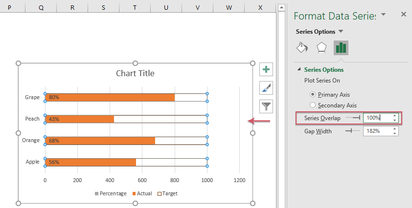
9. 接著,以滑鼠右鍵點擊圖表中的 X 軸,並選擇設定座標軸。在設定座標軸窗格中,於座標軸選項索引標籤下,將最大值調整為 1000.0(即您資料的目標數值),如下圖所示:

10. 最後,根據需求移除其他不必要的圖表元素,即可獲得如下圖所示的進度圖表:

在儲存格中建立水平或垂直進度條
在 Excel 中,您也可以透過使用條件格式在儲存格中建立進度條,請依照下列步驟操作:
使用使用條件格式建立水平進度條
1. 選取您要插入進度條的儲存格,然後按一下開始> 使用條件格式> 資料列> 其他規則,請參閱截圖:

2. 在新增格式設定規則對話方塊中,請執行下列操作:
- 在類型區段中,選擇數字下拉清單中的最小值與最大值;
- 根據您的資料,在最小值與最大值方框中設定最小值與最大值;
- 最後,在填滿下拉選單中選擇純色填滿選項,再挑選您需要的顏色。

3. 然後按一下確定按鈕,進度條就會插入至儲存格,如下方截圖所示:

使用 Sparklines 建立垂直進度條
如果您需要在儲存格中插入垂直進度條,下列步驟可協助您:
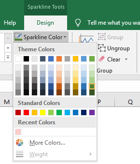
1. 選取您要插入進度條的儲存格,然後按一下插入 > 直條圖(在 Sparklines 群組中),請參閱截圖:

2. 接著,在彈出的 建立 Sparklines對話方塊中,依需求選取資料區域與位置範圍,請參閱截圖:

3. 按一下確定按鈕關閉對話方塊後,您將看到下方的進度條,請參閱截圖:

4. 保持選取進度條儲存格,按一下設計功能區中的索引標籤,然後按一下座標軸> 自訂值(位於)垂直座標軸最小值選項區段),請參閱截圖:

5. 在 Sparklines 垂直座標軸設定對話方塊中,只需點擊確定按鈕即可關閉對話方塊,請參閱截圖:

6. 繼續按一下座標軸> 自訂值(位於)垂直座標軸最大值選項區段),從設計索引標籤,請參閱截圖:

7. 在 Sparklines 垂直座標軸設定對話方塊中,輸入 1.0 後,按一下確定。請參閱截圖:

8. 垂直進度條已建立完成,如下方截圖所示:

使用實用功能,根據百分比或實際值與目標值建立進度條圖
Kutools for Excel 提供數十種 Excel 所沒有的特殊圖表類型,例如子彈圖、目標與實際圖、差值箭頭圖等。透過其便捷工具-進度條圖,您可根據百分比數值或實際與目標值,在 Excel 中輕鬆建立符合需求的進度條形圖。立即免費下載 Kutools for Excel 試用!
下載進度條圖範例檔案

最佳 Office 生產力工具
Kutools for Excel-助您脫穎而出
| 🤖 | KUTOOLS AI 助手:根據以下內容革新數據分析:智慧執行 | 產生程式碼| 建立自訂公式 | 分析資料並產生圖表| 呼叫增強函數…… |
| 熱門功能:尋找、標示或標記重複值 | 刪除空白行 | 合併列或儲存格而不遺失資料 | 不使用公式的四捨五入…… | |
| 超強 VLookup:多重條件 | 多重數值 | 跨多個工作表 | 模糊查找…… | |
| 進階下拉列表:簡易下拉式清單 | 相依性下拉式清單 | 多重選擇下拉式清單…… | |
| 欄位管理員:新增指定數量的欄位 | 移動欄位 | 切換隱藏欄位的可見狀態 |比較欄位以選擇相同/不同單元格…… | |
| 精選功能:網格聚焦 | 設計視圖 | 增強編輯欄 | 工作簿與工作表管理員|資源庫(自動文字)| 日期提取 | 合併工作表 | 加密/解密儲存格 | 依清單傳送電子郵件 | 超級篩選 | 特殊篩選(篩選粗體儲存格/斜體/刪除線……) ...... | |
| 頂尖 15 工具組:12 文字工具(添加文本,刪除特定字符……)| 50+ 圖表 類型(甘特圖……)| 40+ 實用公式(基於生日計算年齡……)| 19 插入工具(插入二維碼,從路徑插入圖片……)| 12 轉換工具(金額轉大寫,匯率轉換……)| 7 合併和拆分工具(高級合併行,拆分 Excel 儲存格……)|……還有更多 |
Kutools for Excel 擁有超過 300 項功能,確保您所需的功能僅需一鍵即可取得……
Office Tab-在 Microsoft Office(包含 Excel)中啟用分頁式閱讀與編輯
- 一秒內在數十份開啟的文件間快速切換!
- 每天為您減少數百次滑鼠點擊,遠離滑鼠手困擾。
- 在檢視與編輯多份文件時,提升您 50% 的工作效率。
- 為 Office(包含 Excel)帶來如 Chrome、Edge 與 Firefox 般高效的分頁功能。