在 Excel 中建立百分比變化圖
在 Excel 中,您通常可以建立簡單的柱狀圖來檢視資料趨勢。若要更直觀地呈現年度間的差異,可於各欄之間加入百分比變化圖(如下圖所示):向上箭號代表後一年相較前一年的成長百分比,向下箭號則代表衰退百分比。
本文將介紹如何在 Excel 中建立柱狀圖,以直觀呈現各欄位之間的百分比變化。

使用誤差線建立百分比變化圖
若要使用誤差線製作百分比變化圖,您需先插入若干輔助欄位(如下方資料所示),再依據這些輔助資料建立圖表。請依照下列步驟操作:

首先,建立輔助欄位資料
1. 在原始資料旁的儲存格 C2 中輸入下列公式,然後將公式拖曳至儲存格 C10(參見截圖):

2. 接著在儲存格 D2 輸入下列公式,並向下拖曳複製至儲存格 D10(參見截圖):

3. 接著在儲存格 E2 輸入下列公式,再向下拖曳填滿控點至儲存格 E9(參見截圖):

4. 接著在儲存格 F2 輸入下列公式,再向下拖曳填滿控點至儲存格 F9(參見截圖):

5. 請在儲存格 G2 輸入下列公式,並向下拖曳至儲存格 G9(參見截圖):

6. 接著在儲存格 H2 輸入下列公式,再將該公式複製到儲存格 H9(參見截圖):

7. 現在插入最後一個輔助欄位,在儲存格 I2 輸入下方公式,再向下拖曳至儲存格 I9,並將小數結果格式化為百分比樣式(參見截圖):

其次,根據輔助欄位資料建立圖表
8. 建立輔助資料後,選取欄位 C、D 及 E 的資料,然後按一下插入> 插入直條圖或條形圖> 群組直條圖(參見截圖):

9. 此時已插入柱狀圖,您可以刪除圖表中不需要的元素,例如圖表標題、圖例或格線(參見截圖):
 |  |
10. 接著,先按一下顯示隱藏資料的直條,再點選圖表元素按鈕,展開圖表元素清單方塊,並選擇誤差線> 其他選項(參見截圖):

11. 在開啟的設定誤差線格式窗格中,於誤差線選項索引標籤下:
- 選取兩者於方向區段;
- 選擇端點帽於末端樣式;
- 在誤差量中選取自訂,然後按一下指定數值。在隨即出現的自訂誤差線對話方塊中,將儲存格 G2:G10 的資料選入正向錯誤值方塊,再將儲存格 H2:H10 選入負向錯誤值方塊。
 |  |
12. 接著點擊確定按鈕,即可獲得如下圖所示的圖表:

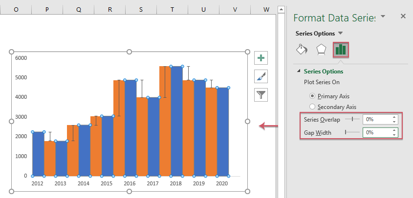
13. 現在對顯示「訂單 1」資料的直條圖按一下滑鼠右鍵,並從快捷選單中選擇設定資料系列格式(參見截圖):

14. 在開啟的設定資料系列格式窗格中,於系列選項索引標籤下,將系列重疊與間距寬度區段的數值皆設為 0%(參見截圖):
15. 現在應隱藏不可見的資料直條:對其中任一直條按一下滑鼠右鍵,在彈出的快捷選單中,從無填滿填滿區段進行選擇(參見截圖):

16. 在仍選取不可見資料直條的狀態下,按一下圖表元素按鈕,選擇資料標籤> 其他選項(參見截圖):

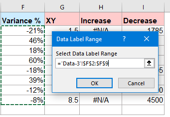
17. 在資料標籤格式窗格中,於標籤選項索引標籤下,勾選儲存格中的值;隨後在彈出的資料標籤範圍提示中,選取變異數範圍數據區域 I2:I9,請參閱螢幕截圖:
 |  |
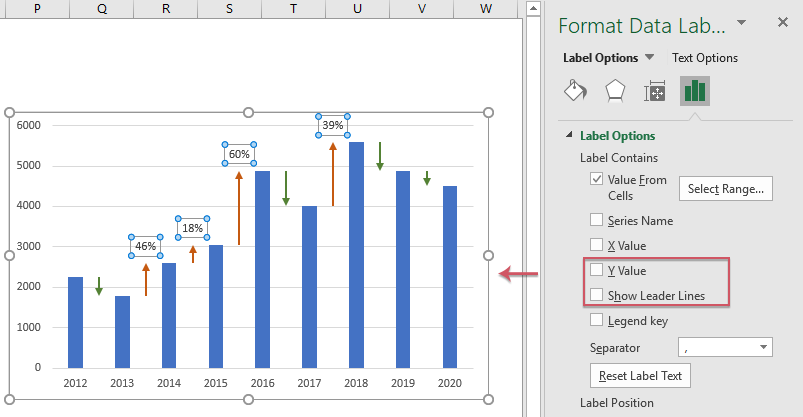
18. 在資料標籤格式窗格中,按一下確定:
- 取消勾選數值與顯示引導線選項(位於)標籤選項);
- 接著將標籤位置指定為末端外側(位於)標籤位置)。

19. 現在,您可以看到資料標籤已成功新增至圖表中!您可以將負百分比標籤設為內部末端,並依需求自由格式化資料標籤,詳情請參閱下方螢幕截圖:

使用上下箭頭建立百分比變化圖
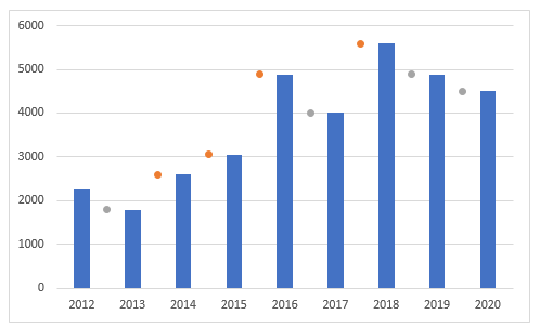
有時,您可能希望以箭頭取代誤差線:若明年資料增加,則顯示向上箭頭;若資料減少,則顯示向下箭頭。資料標籤與箭頭將隨資料變動而自動更新,如下方示範所示。

若要建立此類圖表,您需插入兩部分輔助資料,如下方螢幕截圖所示:第一部分用於計算變異數與百分比變異數(如藍色區塊所示),第二部分則用於自訂上升與下降的誤差線(如紅色區塊所示)。

首先,建立輔助欄位資料
1. 若要插入第一部分的輔助資料,請套用下列公式:
D2:=B2 (將公式拖曳至儲存格 D10)
E2:=B 3-B2 (將公式拖曳至儲存格 E9)
F2:=E2/B2 (將公式拖曳至儲存格 F9)

2. 接著套用以下公式,建立第二部分的輔助資料:
H2:=IF(B3>=B2,B3,NA()) (將公式拖曳至儲存格 H9)
I2:=IF(B3<B2,B3,NA()) (將公式拖曳至儲存格 I9)

其次,根據輔助欄位資料建立圖表
3. 選取 C 欄與 D 欄的資料,然後依序點選插入> 插入直條圖或條形圖> 群集直條圖,即可依照下方螢幕截圖所示插入柱狀圖:

4. 接著按下 Ctrl + C,複製 G 欄、H 欄與 I 欄中的資料,再點選圖表(請參閱螢幕截圖):

5. 選取圖表後,請按一下開始> 貼上> 選擇性貼上,在選擇性貼上對話方塊中,選取新增數列與欄選項,並勾選第一列包含系列名稱及 第一欄包含分類(X 標籤)選項,請參閱螢幕截圖:
 |  |
6. 接著,您將看到如下方螢幕截圖所示的圖表:

7. 在圖表中任意點選直條圖,再從快捷選單選擇變更數列圖表類型,請參閱螢幕截圖:

8. 在變更儀表類型對話方塊中,將上升與下降皆設為散點圖,並取消勾選次要座標軸核取方塊(適用於)「為您的數列選擇儀表類型與座標軸」清單中的每一項)。請參閱螢幕截圖:

9. 接著按一下確定按鈕,即可獲得一個組合圖,其中標記會顯示在相應直條之間。請參閱螢幕截圖:
10. 接著點選上升數列(橘色圓點),再點擊圖表元素按鈕,並從清單中勾選誤差線,即可將誤差線新增至圖表中,請參閱螢幕截圖:

11. 選取水平誤差線,按下 Delete 鍵即可刪除,詳情請參閱螢幕截圖:

12. 接著選取垂直誤差線,按一下滑鼠右鍵,並選擇設定誤差線格式;在設定誤差線格式窗格中,於誤差線選項索引標籤下,執行下列操作:
- 從兩者選項中選取方向;
- 從無端點帽選取末端樣式;
- 在誤差量區段中,選取自訂,然後按一下指定數值按鈕。在彈出的自訂誤差線對話方塊中,於正向錯誤值方塊輸入 ={0},並於負向錯誤值方塊選取變異數值 E2:E9.
- 接著點擊確定按鈕。
 |  |
13. 現在仍在設定誤差線格式窗格中,請點選填滿與線條索引標籤,並執行下列操作:
- 在實線區段中選取線條,並選擇所需顏色,再依需求設定線條寬度;
- 從起始箭號類型下拉清單中,選擇您想要的箭號樣式。

14. 在此步驟中,您應隱藏標記(橘色圓點):選取橘色圓點,按一下滑鼠右鍵,從快捷選單選擇設定資料數列格式,在開啟的設定資料數列格式窗格中,於填滿與線條索引標籤下,點選標記區段,並從標記選項中選取無。請參閱螢幕截圖:

15. 重複上述步驟 10–14,為下降資料數列插入向下箭頭並隱藏灰色標記,即可獲得如下方螢幕截圖所示的圖表:

16. 插入箭頭後,請新增資料標籤:先按一下以選取隱藏的上升數列,再點選圖表元素> 資料標籤> 上方,詳情請參閱螢幕截圖:

17. 接著在任一資料標籤上按一下滑鼠右鍵,從快捷選單選擇設定資料標籤格式;在展開的設定資料標籤格式窗格中,於標籤選項索引標籤下勾選儲存格中的值選項,隨即會彈出資料標籤範圍對話方塊,請選取變異百分比儲存格(F2:F9),詳情請參閱螢幕截圖:
 |  |
18. 按一下確定關閉對話方塊後,仍在設定資料標籤格式窗格中,請取消勾選 Y 值與顯示引導線選項,詳情請參閱螢幕截圖:
19. 接著,只需重複上述步驟 16–18,即可成功建立百分比變化圖:這次請在下降資料點下方新增標籤,並於下方的資料標籤子選單中選擇圖表元素。詳情請參閱螢幕截圖:

運用強大功能建立百分比變化圖
對多數人而言,上述方法過於繁瑣;但若您擁有 Kutools for Excel,就能輕鬆突破限制!它內建多種 Excel 原生不支援的特殊圖表類型,例如子彈圖、目標與實際圖、斜率圖等。透過其直覺化工具——柱狀圖含百分比變化,您即可在 Excel 中快速建立帶有上下箭號的百分比變化圖,操作簡單又高效!立即點擊下載 Kutools for Excel 免費試用!
下載百分比變化圖範例檔案

最佳 Office 生產力工具
Kutools for Excel-助您脫穎而出
| 🤖 | KUTOOLS AI 助手:根據以下內容革新數據分析:智慧執行 | 產生程式碼| 建立自訂公式 | 分析資料並產生圖表| 呼叫增強函數…… |
| 熱門功能:尋找、標示或標記重複值 | 刪除空白行 | 合併列或儲存格而不遺失資料 | 不使用公式的四捨五入…… | |
| 超強 VLookup:多重條件 | 多重數值 | 跨多個工作表 | 模糊查找…… | |
| 進階下拉列表:簡易下拉式清單 | 相依性下拉式清單 | 多重選擇下拉式清單…… | |
| 欄位管理員:新增指定數量的欄位 | 移動欄位 | 切換隱藏欄位的可見狀態 |比較欄位以選擇相同/不同單元格…… | |
| 精選功能:網格聚焦 | 設計視圖 | 增強編輯欄 | 工作簿與工作表管理員|資源庫(自動文字)| 日期提取 | 合併工作表 | 加密/解密儲存格 | 依清單傳送電子郵件 | 超級篩選 | 特殊篩選(篩選粗體儲存格/斜體/刪除線……) ...... | |
| 頂尖 15 工具組:12 文字工具(添加文本,刪除特定字符……)| 50+ 圖表 類型(甘特圖……)| 40+ 實用公式(基於生日計算年齡……)| 19 插入工具(插入二維碼,從路徑插入圖片……)| 12 轉換工具(金額轉大寫,匯率轉換……)| 7 合併和拆分工具(高級合併行,拆分 Excel 儲存格……)|……還有更多 |
Kutools for Excel 擁有超過 300 項功能,確保您所需的功能僅需一鍵即可取得……
Office Tab-在 Microsoft Office(包含 Excel)中啟用分頁式閱讀與編輯
- 一秒內在數十份開啟的文件間快速切換!
- 每天為您減少數百次滑鼠點擊,遠離滑鼠手困擾。
- 在檢視與編輯多份文件時,提升您 50% 的工作效率。
- 為 Office(包含 Excel)帶來如 Chrome、Edge 與 Firefox 般高效的分頁功能。