在 Excel 中根據數值變更圖表顏色
有時插入圖表後,您可能希望根據不同的數值範圍,以不同顏色呈現資料系列。例如:數值介於 0–60 時顯示藍色,71–80 顯示灰色,81–90 則顯示黃色,依此類推(如下圖所示)。本教學將介紹如何在 Excel 中依據數值自動變更圖表顏色。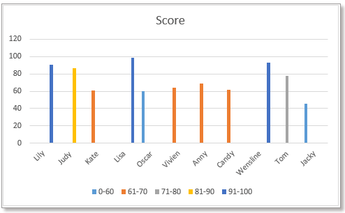
根據數值變更直條圖/長條圖圖表顏色
方法 1:使用公式與內建圖表功能變更長條圖顏色
方法 2:使用實用工具變更長條圖顏色
首先,請依照下圖建立資料:列出各數值範圍,並在資料右側以該數值範圍作為欄位標題。
1. 在儲存格 C5 中輸入下列公式:
接著向下拖曳填滿控制點以填滿儲存格,然後繼續向右拖曳控制點。
2. 接著選取欄位名稱,按住 Ctrl 鍵,再選取包含數值範圍標題的公式儲存格。
3. 點選「插入」>「插入直條圖或條形圖」,依需求選擇「群組直條圖」或「群組長條圖」。
圖表插入後,其顏色將依數值自動變化。
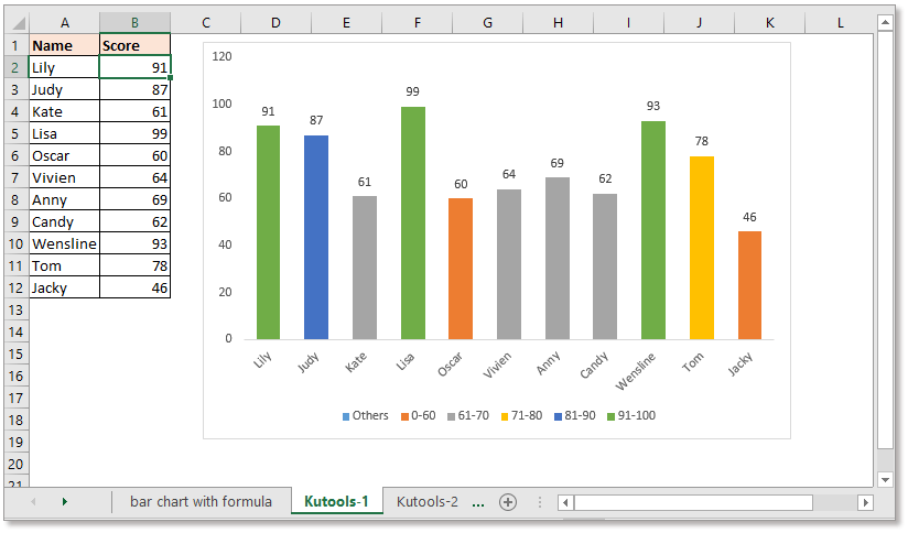
有時使用公式建立圖表時,若公式出錯或遭刪除,可能引發問題。此時,Kutools for Excel 的「根據數值變更圖表顏色」功能可助您輕鬆解決!
免費安裝 Kutools for Excel 後,請依照下列步驟操作:
1. 點選「Kutools」>「圖表」>「根據數值變更圖表顏色」,如下圖所示:
2. 在彈出的對話方塊中,請執行下列操作:
1)先選取您要使用的儀表類型,再分別選取軸標籤區域與系列值(不含欄位標題)。
2)接著點選「新增」按鈕 ,依需求加入數值範圍。
3)重複上述步驟,將所有數值範圍加入「群組」清單後,按一下「確定」。
提示:
1. 雙擊直條或長條,即可開啟「資料點格式設定」窗格,輕鬆變更顏色。
2. 若先前已插入直條圖或條形圖,即可使用「按值填充圖表顏色」功能,依數值自動變更圖表色彩。
選取條形圖或柱狀圖,然後點選「Kutools」>「圖表」>「按值填充圖表顏色」。在彈出的對話方塊中,依需求設定數值範圍與對應顏色。立即免費下載!
若要根據數值插入不同顏色的折線圖,您需要使用另一組公式。
首先,請依照下圖建立資料:列出各數值範圍,並在資料右側以該數值範圍作為欄位標題。
注意:資料系列數值必須依 A 到 Z 順序排列。
1. 在儲存格 C5 中輸入以下公式:
接著向下拖曳填滿控制點以填滿儲存格,再向右拖曳控制點。
3. 選取包含數值範圍標題與公式儲存格的資料區域,如下圖所示:
4. 點選「插入」>「插入折線圖或區域圖」,然後選擇「折線圖」類型。
現在已完成建立,折線圖將根據數值以不同顏色呈現。
在 Excel 中建立帶有系列選取核取方塊的互動式圖表
在 Excel 中,我們通常會插入圖表來更清晰地呈現資料。當圖表包含多個資料系列時,您可能希望透過勾選核取方塊,輕鬆切換顯示特定系列,讓數據洞察一目了然!
使用條件格式製作堆疊條形圖(Excel 版)
本教學將逐步說明如何在 Excel 中建立如下圖所示的條件格式堆疊條形圖。
在 Excel 中逐步建立實際值與預算值比較圖表
本教學將逐步說明如何在 Excel 中建立如圖所示的條件格式堆疊條形圖,輕鬆掌握預算與實際數據的視覺化比較!
- 超強編輯欄(輕鬆編輯多行文字與公式);閱讀版面(輕鬆閱讀與編輯大量儲存格);貼上至篩選範圍……
- 合併儲存格/列/欄並保留資料;分割儲存格內容;合併重複行並加總/平均……防止重複項儲存格;比較範圍……
- 選取重複或唯一列;選取空白列(所有儲存格皆為空);超級查找與模糊搜尋多個活頁簿;隨機選取……
- 精確公式複製多個儲存格而不變更公式參照;自動建立參照至多個工作表;插入項目符號、複選框及更多……
- 收藏並快速插入公式、範圍、圖表與圖片;加密儲存格並設定密碼;建立郵件清單並寄送電子郵件……
- 提取文本、添加文本、刪除某位置字元、移除空格;建立並列印數據分頁統計;在儲存格內容與註解之間轉換……
- 超級篩選(儲存並套用篩選方案至其他工作表);高級排序依月份/週/日、頻率等;特殊篩選依粗體、斜體……
- 合併活頁簿與工作表;合併表格依據關鍵列;分割數據至多個工作表;批次轉換 xls、xlsx 與 PDF……
- 資料透視表依週數、星期幾等分組……顯示未鎖定、選區鎖定以不同顏色標示;突顯包含公式/名稱的儲存格……
")
- 在 Word、Excel、PowerPoint、Publisher、Access、Visio 與 Project 中啟用分頁式編輯與閱讀,提升工作效率!
- 在同一視窗的新分頁中開啟並建立多份文件,而非另開新視窗。
- 每天為您提升 50% 的工作效率,省下數百次滑鼠點擊!
")