如何在 Excel 中為堆疊柱形圖添加總計標籤?
對於堆疊條形圖,您可以輕鬆為各個組成部分新增資料標籤。然而,有時為了提升圖表的可讀性與清晰度,您可能希望在堆疊長條圖的頂端顯示一個浮動的總計數值。雖然基本圖表功能並不支援直接為各元件總和新增總計資料標籤,但透過以下步驟,您就能輕鬆實現此效果。
- 在 Excel 中為堆疊柱形圖新增總計標籤(9 個步驟)
- 使用強大工具為堆疊柱形圖新增總計標籤(2 個步驟)
- 在 Excel 中建立含總計標籤的堆疊柱形圖(3 個步驟)
在 Excel 中為堆疊柱形圖新增總計標籤
假設您擁有以下表格資料。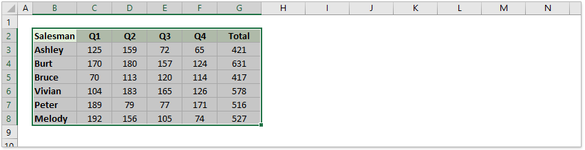
1. 首先,選取要建立圖表的資料,接著點選插入> 直條圖,並在二維直條圖下方選擇「堆疊直條圖」。請參閱以下截圖:
堆疊直條圖已成功建立!
2. 接著以滑鼠右鍵按一下總計數列,並從右鍵功能表中選取變更數列儀表類型。
3. 在變更儀表類型對話方塊中,針對總計資料數列,點選儀表類型下拉列表,從中選取折線圖,然後按一下確定按鈕。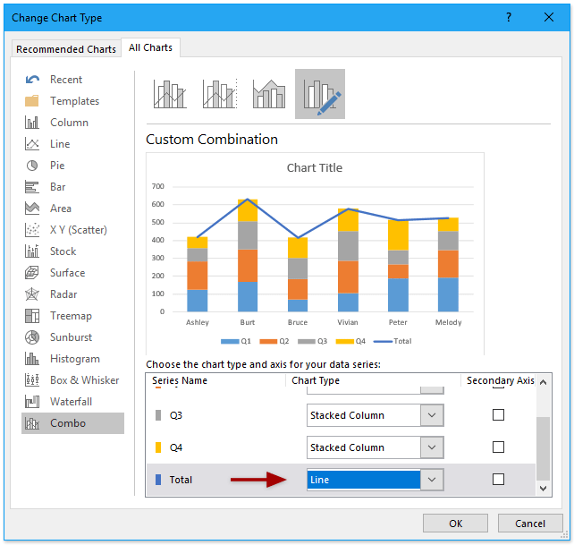
現在總計資料數列已成功變更為折線圖儀表類型!請參閱下方截圖:
4. 選取換行圖表,按一下滑鼠右鍵,然後從右鍵功能表中選擇新增資料標籤> 新增資料標籤。請參閱截圖:
現在每個資料點都已為總計資料數列加上資料標籤,並顯示於各直條的右上角。
5. 繼續選取資料標籤,按一下滑鼠右鍵,並從內容功能表中選擇設定資料標籤。請參閱截圖:
6. 在設定資料標籤窗格中,於標籤選項索引標籤下,勾選上方選項(位於)標籤位置區段)。請參閱截圖:
7. 接著,您需要將折線圖隱藏起來:以滑鼠右鍵點擊該折線,然後選取設定資料數列。請參閱下方截圖:
8. 在設定資料數列窗格中,於填滿與線條索引標籤下,勾選無線條選項。請參閱截圖:
現在,總計標籤已新增並顯示在堆疊直條圖的上方,但總計資料數列的標籤仍顯示於圖表區域底部。
9. 您可以透過滑鼠右鍵按一下總計資料數列標籤,並從內容功能表中選取「刪除」來移除;或者,也可直接選取該標籤後按下 Delete 鍵,輕鬆完成移除!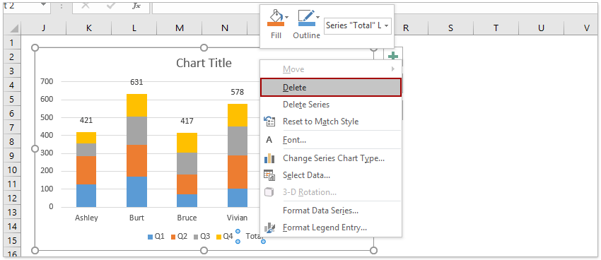
至此,您已成功建立堆疊柱形圖,並為每個堆疊直條新增總計標籤。
使用強大工具為堆疊柱形圖新增總計標籤
若您已安裝 Kutools for Excel,即可在 Excel 中輕鬆透過單次點擊,快速為堆疊柱形圖加入所有總計標籤!
1. 建立堆疊柱形圖:先選取原始數據,然後依序點選插入> 插入直條圖或條形圖> 堆疊直條圖。
2. 選取堆疊柱形圖後,點選 Kutools> 圖表> 圖表工具> 添加總和標籤到圖表。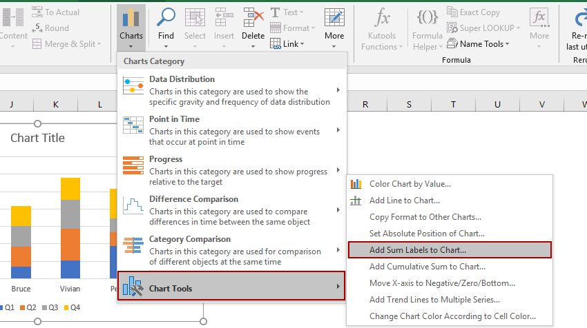
隨即會將所有總計標籤立即新增至堆疊柱形圖的每個資料點。
在 Excel 中建立含總計標籤的堆疊柱形圖
若您已安裝 Kutools for Excel,只需點擊幾下,即可快速建立同時包含總計標籤與百分比資料標籤的堆疊直條圖!
1. 假設您已準備好如下方截圖所示的原始數據。
2. 選取來源區域,然後按一下 Kutools> 圖表> 百分比堆疊圖 以啟用此功能。
3. 在百分比堆疊圖對話方塊中,請依需求指定數據區域、軸標籤區域與圖例項目,然後按一下確定按鈕。
提示:百分比堆疊圖功能可根據所選數據來源自動設定數據區域、軸標籤區域與圖例項目,您只需確認自動選取的區域是否正確即可!
現在已建立堆疊柱形圖,其中包含總計資料標籤與以百分比顯示的資料點標籤。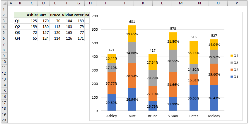
注意事項:
若您不需要資料點的百分比標籤,請以滑鼠右鍵點擊該標籤,並從內容功能表中選取刪除。(此操作一次僅能移除一組資料數列的百分比標籤)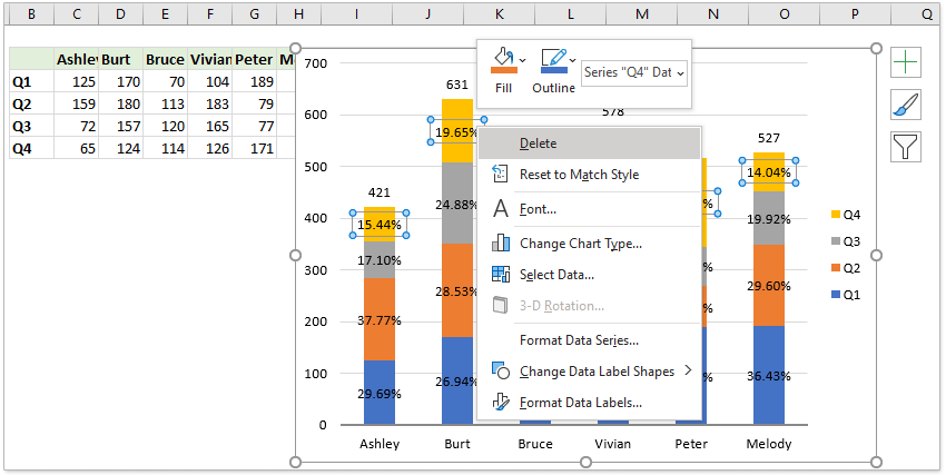
示範:在 Excel 中為堆疊柱形圖新增總計標籤
相關文章:
最佳 Office 生產力工具
| 🤖 | KUTOOLS AI 助手:基於以下內容徹底革新數據分析:智慧執行 | 產生程式碼| 建立自訂公式 | 分析資料並產生圖表| 呼叫增強函數…… |
| 熱門功能:尋找、醒目提示或標記重複值 | 刪除空白行 | 合併列或儲存格而不遺失資料 | 不使用公式的四捨五入…… | |
| 高級 LOOKUP:多重條件 VLookup | 多重數值 VLookup | 跨多個工作表 VLookup | 模糊查找…… | |
| 高級下拉列表:快速建立下拉式清單 | 相依式下拉式清單 | 多選下拉式清單…… | |
| 欄位管理員:新增指定數量的欄位|移動欄位|切換隱藏欄位的可見狀態|比較範圍與欄位…… | |
| 精選功能:網格聚焦 | 設計視圖 |增強編輯欄 | 工作簿與工作表管理員 | 資源庫(自動文字)| 日期提取 | 合併工作表 | 加密/解密儲存格 | 依清單傳送電子郵件 | 超級篩選 | 特殊篩選(篩選粗體儲存格/斜體/刪除線……) ...... | |
| 頂尖 15 工具組:12 文字工具(添加文本,刪除特定字符,……)| 50+ 圖表 類型(甘特圖,……)| 40+ 實用公式(基於生日計算年齡,……)| 19 插入工具(插入二維碼,從路徑插入圖片,……)| 12 轉換工具(金額轉大寫,匯率轉換,……)| 7 合併和拆分工具(高級合併行,分割儲存格,……)|……以及更多 |
運用 Kutools for Excel 強化您的 Excel 技能,體驗前所未有的高效能!Kutools for Excel 提供超過 300 項進階功能,大幅提升生產力並節省寶貴時間。立即點擊,取得您最需要的功能……
Office Tab 為 Office 帶來分頁式介面,讓您的工作更輕鬆自在!
- 在 Word、Excel、PowerPoint 中啟用分頁式編輯與閱讀功能,以及 Access、Visio 與 Project。
- 在同視窗的新分頁中開啟並建立多份文件,而非另開新視窗。
- 每天為您提升 50% 的工作效率,並省下數百次滑鼠點擊!
所有 Kutools 增益集,一個安裝程式
Kutools for Office 套件整合了 Excel、Word、Outlook 與 PowerPoint 的增益集,以及 Office Tab Pro,非常適合需要跨多個 Office 應用程式協作的團隊使用!
- 全能套件— 包含 Excel、Word、Outlook 與 PowerPoint 增益集,以及 Office Tab Pro
- 一個安裝程式,一個授權— 數分鐘內即可完成設定(支援 MSI)
- 協同運作更出色— 在多個 Office 應用程式間實現流暢的生產力體驗
- 30 天完整功能試用— 無需註冊,無需信用卡
- 超值之選— 比單獨購買各增益集更省費用