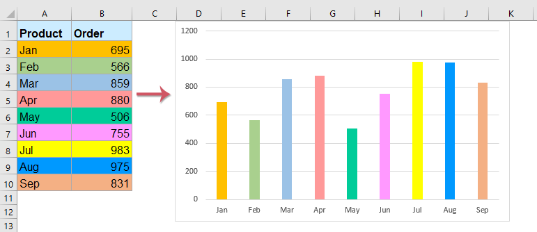
如何在Excel中根據單元格顏色為圖表著色?
通常,當您創建圖表時,列欄的顏色是默認值。 如果需要根據顯示的單元格顏色來設置每個條形上的填充顏色的格式,如下所示,如何在Excel中解決呢?
使用VBA代碼根據單元格顏色使用一個或多個數據系列為圖表著色
使用具有驚人功能的基於單元格顏色的一個或多個數據系列為圖表著色
使用VBA代碼根據單元格顏色使用一個或多個數據系列為圖表著色
使用基於單元格顏色的一個數據系列為圖表著色
使用以下VBA代碼,您可以根據原始單元格值的顏色快速更改包含一個數據系列的圖表的顏色,請執行以下操作:
1。 首先,按照顯示的屏幕截圖創建條形圖或柱形圖(選擇數據並單擊 插入 > 插入柱形圖或條形圖):

2。 按住 ALT + F11 鍵打開 Microsoft Visual Basic for Applications 窗口。
3。 點擊 插入 > 模塊,然後將以下代碼粘貼到“模塊窗口”中。
VBA代碼:具有基於單元格顏色的一個數據系列的顏色圖表條:
Sub ColorChartColumnsbyCellColor()
'Updateby Extendoffice
    Dim xChart As Chart
    Dim I As Long, xRows As Long
    Dim xRg As Range, xCell As Range
    On Error Resume Next
    Set xChart = ActiveSheet.ChartObjects("Chart 1").Chart
    If xChart Is Nothing Then Exit Sub
    With xChart.SeriesCollection(1)
        Set xRg = ActiveSheet.Range(Split(Split(.Formula, ",")(1), "!")(1))
        xRows = xRg.Rows.Count
        Set xRg = xRg(1)
        For I = 1 To xRows
            .Points(I).Format.Fill.ForeColor.RGB = ThisWorkbook.Colors(xRg.Offset(I - 1, 0).Interior.ColorIndex)
        Next
    End With
End Sub
備註:在上面的代碼中, 圖1 是您要使用的圖表名稱,請更改為您自己的名稱。
4。 粘貼以上代碼後,請按 F5 鍵以運行此代碼,並且圖表條的顏色已根據原始單元格顏色進行了更改,請參見屏幕截圖:

根據單元格顏色為圖表添加多個數據系列
如果您的圖表包含多個數據系列,請應用以下VBA代碼:
1。 請創建包含多個數據系列的條形圖或柱形圖,如下圖所示:

2。 按住 ALT + F11 鍵打開 Microsoft Visual Basic for Applications 窗口。
3。 點擊 插入 > 模塊,然後將以下代碼粘貼到“模塊”窗口中。
VBA代碼:具有基於單元格顏色的多個數據系列的顏色圖表條:
Sub CellColorsToChart()
'Updateby Extendoffice
    Dim xChart As Chart
    Dim I As Long, J As Long
    Dim xRowsOrCols As Long, xSCount As Long
    Dim xRg As Range, xCell As Range
    On Error Resume Next
    Set xChart = ActiveSheet.ChartObjects("Chart 1").Chart
    If xChart Is Nothing Then Exit Sub
    xSCount = xChart.SeriesCollection.Count
    For I = 1 To xSCount
        J = 1
        With xChart.SeriesCollection(I)
            Set xRg = ActiveSheet.Range(Split(Split(.Formula, ",")(2), "!")(1))
            If xSCount > 4 Then
                xRowsOrCols = xRg.Columns.Count
            Else
                xRowsOrCols = xRg.Rows.Count
            End If
            For Each xCell In xRg
                .Points(J).Format.Fill.ForeColor.RGB = ThisWorkbook.Colors(xCell.Interior.ColorIndex)
                .Points(J).Format.Line.ForeColor.RGB = ThisWorkbook.Colors(xCell.Interior.ColorIndex)
                J = J + 1
            Next
        End With
    Next
End Sub
4。 然後按 F5 要運行此代碼,請立即將原始單元格顏色填充在圖表欄中,請參見屏幕截圖:

筆記:
1.在上面的代碼中, 圖1 是您要使用的圖表名稱,請更改為您自己的名稱。
2.此代碼也可以應用於折線圖。
使用具有驚人功能的基於單元格顏色的一個或多個數據系列為圖表著色
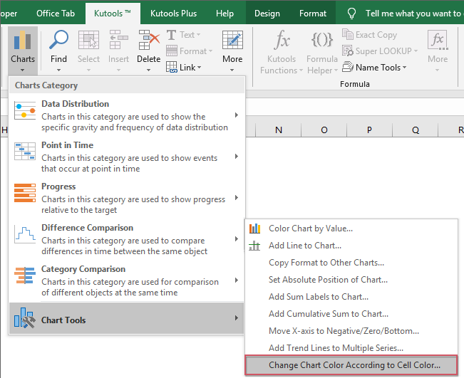
通過使用上述代碼,圖表的顏色將不會始終與單元格顏色匹配,為解決此問題,在這裡,我將介紹一個有用的工具- 根據單元格顏色更改圖表顏色 of Excel的Kutools,借助此方便的功能,您可以快速輕鬆地根據單元格顏色為圖表著色。
安裝後 Excel的Kutools,請這樣做:
1。 首先,請插入要使用的圖表,然後選擇圖表,然後單擊 庫工具 > 圖表 > 圖表工具 > 根據單元格顏色更改圖表顏色,請參見屏幕截圖:
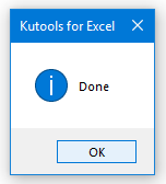
2。 然後彈出一個提示框,請點擊 OK 按鈕。
3。 現在,所選的圖表已根據單元格顏色進行了著色,如下圖所示:
使用基於單元格顏色的一個數據系列為圖表著色

根據單元格顏色為圖表添加多個數據系列

更多相關圖表文章:
- 在Excel中創建覆蓋另一個條形圖的條形圖
- 當我們創建具有兩個數據系列的群集條形圖或柱形圖時,兩個數據系列條形圖將並排顯示。 但是,有時,我們需要使用重疊或重疊的條形圖來更清晰地比較兩個數據系列。 在本文中,我將討論如何在Excel中創建重疊的條形圖。
- 在Excel中將一種圖表格式複製到其他圖表格式
- 假設工作表中有多種不同類型的圖表,您已根據需要設置了一個圖表的格式,現在您希望將此圖表格式應用於其他圖表。 當然,您可以手動手動設置其他格式,但這會浪費很多時間,是否有任何快速或便捷的方法可以將一種圖表格式複製到Excel中的其他格式?
- 在圖表中突出顯示最大和最小數據點
- 如果您有一個柱形圖,想要用不同的顏色突出顯示最高或最小的數據點,以使其脫穎而出,如下面的屏幕截圖所示。 您如何確定最大值和最小值,然後快速突出顯示圖表中的數據點?
- 在Excel中創建步驟圖
- 步圖用於顯示不定期發生的變化,它是折線圖的擴展版本。 但是,沒有直接的方法可以在Excel中創建它。 本文,我將討論如何在Excel工作表中逐步創建步驟圖。
- 在Excel中創建進度條形圖
- 在Excel中,進度條形圖可以幫助您監視實現目標的進度,如下圖所示。 但是,如何在Excel工作表中創建進度條形圖?
最佳辦公生產力工具
| 🤖 | Kutools 人工智慧助手:基於以下內容徹底改變數據分析: 智慧執行 | 生成代碼 | 建立自訂公式 | 分析數據並產生圖表 | 呼叫 Kutools 函數... |
| 熱門特色: 尋找、突出顯示或識別重複項 | 刪除空白行 | 合併列或儲存格而不遺失數據 | 沒有公式的回合 ... | |
| 超級查詢: 多條件VLookup | 多值VLookup | 跨多個工作表的 VLookup | 模糊查詢 .... | |
| 高級下拉列表: 快速建立下拉列表 | 依賴下拉列表 | 多選下拉列表 .... | |
| 欄目經理: 新增特定數量的列 | 移動列 | 切換隱藏列的可見性狀態 | 比較範圍和列 ... | |
| 特色功能: 網格焦點 | 設計圖 | 大方程式酒吧 | 工作簿和工作表管理器 | 資源庫 (自動文字) | 日期選擇器 | 合併工作表 | 加密/解密單元格 | 按清單發送電子郵件 | 超級濾鏡 | 特殊過濾器 (過濾粗體/斜體/刪除線...)... | |
| 前 15 個工具集: 12 文本 工具 (添加文本, 刪除字符,...) | 50+ 圖表 類型 (甘特圖,...) | 40+ 實用 公式 (根據生日計算年齡,...) | 19 插入 工具 (插入二維碼, 從路徑插入圖片,...) | 12 轉化 工具 (數字到單詞, 貨幣兌換,...) | 7 合併與拆分 工具 (高級合併行, 分裂細胞,...) | ... 和更多 |
使用 Kutools for Excel 增強您的 Excel 技能,體驗前所未有的效率。 Kutools for Excel 提供了 300 多種進階功能來提高生產力並節省時間。 點擊此處獲取您最需要的功能...
")
Office選項卡為Office帶來了選項卡式界面,使您的工作更加輕鬆
- 在Word,Excel,PowerPoint中啟用選項卡式編輯和閱讀,發布者,Access,Visio和Project。
- 在同一窗口的新選項卡中而不是在新窗口中打開並創建多個文檔。
- 將您的工作效率提高 50%,每天為您減少數百次鼠標點擊!
")