跳到主要內容

如何在Excel中的圖表中對(兩級)軸標籤進行分組?

例如,您有一個購買表,如下圖所示,您需要創建一個帶有兩個槓桿的日期標籤和水果標籤的X軸標籤的柱形圖,同時將日期標籤按水果分組,如何解決它? 本文提供了幾種方法來幫助您在Excel圖表中對(兩級)軸標籤進行分組。


通過調整Excel中源數據的佈局來分組(兩級)軸標籤

第一種方法將指導您在Excel中創建柱形圖之前更改源數據的佈局。 您可以執行以下操作:

1。 將水果列移到“日期”列之前,先切割水果列,然後在“日期”列之前粘貼。

2。 選擇水果列,但列標題除外。 在我們的情況下,請選擇範圍A2:A17,然後單擊 將A到Z排序 上的按鈕 數據 標籤。
doc組軸標籤2

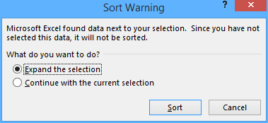
3。 在拋出“排序警告”對話框中,保留 擴大選擇 選項已選中,然後單擊 分類 按鈕。

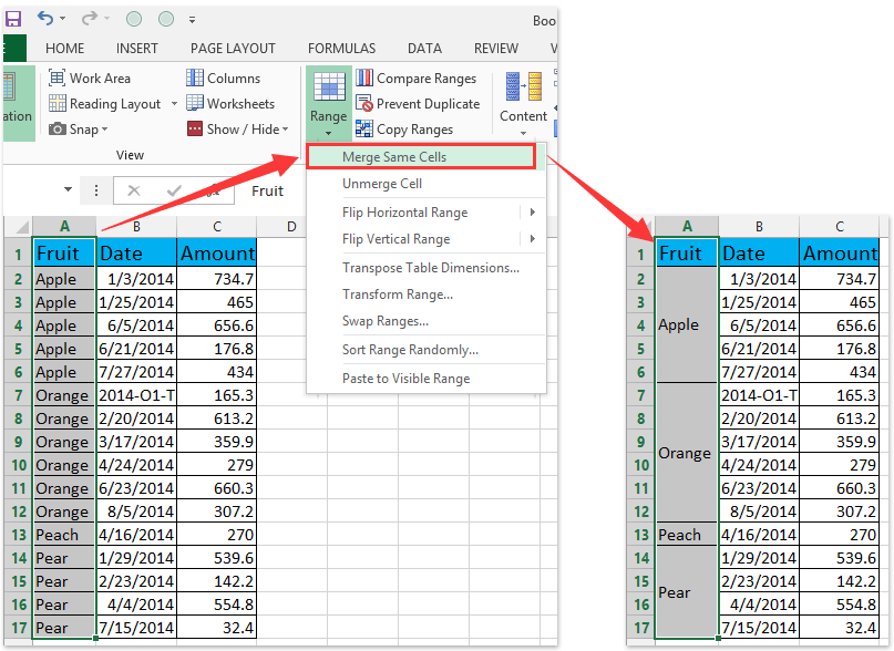
4。 在“水果”列中,選擇第一個相同的單元格序列,表示A2:A6,然後單擊 首頁 > 合併與中心。 然後在彈出的Microsoft Excel對話框中單擊“確定”按鈕。 請參閱以下屏幕截圖:
doc組軸標籤01doc組軸標籤02
然後合併由Apple填充的第一系列相鄰單元格。 見下面的截圖:
doc組軸標籤03

5。 重複步驟4,並合併其他填充相同值的相鄰單元格。

提示:一鍵合併Excel中所有用相同值填充的相鄰單元格
如果您已安裝Kutools for Excel,則可以應用它 合併相同的單元格 實用程序,只需單擊一下即可合併包含相同值的所有相鄰單元格。


廣告合併相同的單元格2

6。 選擇源數據,然後單擊 插入柱形圖 )> 插入 標籤。

現在,新創建的柱形圖具有兩級X軸,並且在X軸中,日期標籤按水果分組。 請參見下面的屏幕截圖:


在Excel中使用數據透視圖對(兩級)軸標籤進行分組

數據透視圖工具功能如此強大,它可以幫助您在Excel中輕鬆地創建一種圖表,該圖表的一種標籤由另一種標籤在兩個槓桿軸中分組。 您可以執行以下操作:

1。 通過選擇源數據創建數據透視圖,並:
(1)在Excel 2007和2010中,單擊 數據透視表 > 數據透視圖 ,在 組上 插入 標籤;
(2)在Excel 2013中,單擊 樞軸圖表 > 樞軸圖表 ,在 圖表 組上 插入 標籤。

2。 在打開的對話框中,選中 現有工作表 選項,然後在當前工作表中選擇一個單元格,然後單擊 OK 按鈕。

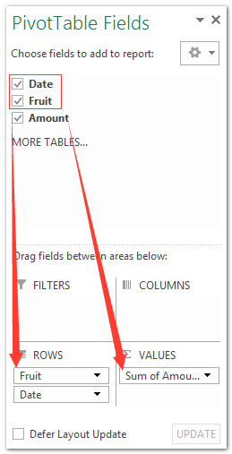
3。 現在,在打開的“數據透視表字段”窗格中,將“日期”字段和“水果”字段拖到 部分,然後將金額拖到 價值觀 部分。

筆記:
(1)提交的水果必須高於提交的日期 部分。
(2)除了拖動外,還可以右鍵單擊一個文件,然後選擇 添加到行標籤 or 增值 在右鍵菜單中。

然後,日期標籤在新創建的數據透視圖中按水果自動分組,如下圖所示:


演示:法線圖表或數據透視圖中的組(兩級)軸標籤


Excel的Kutools:超過 300 個方便的工具觸手可及! 立即開始 30 天免費試用,沒有任何功能限制。 現在就下載!

最佳辦公生產力工具

🤖 Kutools 人工智慧助手:基於以下內容徹底改變數據分析: 智慧執行   |  生成代碼  |  建立自訂公式  |  分析數據並產生圖表  |  呼叫 Kutools 函數...
熱門特色: 尋找、突出顯示或識別重複項   |  刪除空白行   |  合併列或儲存格而不遺失數據   |   沒有公式的回合 ...
超級查詢: 多條件VLookup    多值VLookup  |   跨多個工作表的 VLookup   |   模糊查詢 ....
高級下拉列表: 快速建立下拉列表   |  依賴下拉列表   |  多選下拉列表 ....
欄目經理: 新增特定數量的列  |  移動列  |  切換隱藏列的可見性狀態  |  比較範圍和列 ...
特色功能: 網格焦點   |  設計圖   |   大方程式酒吧    工作簿和工作表管理器   |  資源庫 (自動文字)   |  日期選擇器   |  合併工作表   |  加密/解密單元格    按清單發送電子郵件   |  超級濾鏡   |   特殊過濾器 (過濾粗體/斜體/刪除線...)...
前 15 個工具集12 文本 工具 (添加文本, 刪除字符,...)   |   50+ 圖表 類型 (甘特圖,...)   |   40+ 實用 公式 (根據生日計算年齡,...)   |   19 插入 工具 (插入二維碼, 從路徑插入圖片,...)   |   12 轉化 工具 (數字到單詞, 貨幣兌換,...)   |   7 合併與拆分 工具 (高級合併行, 分裂細胞,...)   |   ... 和更多

使用 Kutools for Excel 增強您的 Excel 技能,體驗前所未有的效率。 Kutools for Excel 提供了 300 多種進階功能來提高生產力並節省時間。  點擊此處獲取您最需要的功能...

產品描述


Office選項卡為Office帶來了選項卡式界面,使您的工作更加輕鬆

  • 在Word,Excel,PowerPoint中啟用選項卡式編輯和閱讀,發布者,Access,Visio和Project。
  • 在同一窗口的新選項卡中而不是在新窗口中打開並創建多個文檔。
  • 將您的工作效率提高 50%,每天為您減少數百次鼠標點擊!
Comments (7)
No ratings yet. Be the first to rate!
This comment was minimized by the moderator on the site
Thank you! In order to save space, is it possible to only label the first and last date in the series? I've tried changing the "interval unit" setting under label, but it doesn't seem to have any effect on a multi-level chart. I also tried setting the middle date labels to spaces or blanks, but that completely confused excel.,
This comment was minimized by the moderator on the site
Hi Kathy,
There is another trick that can save space in the X axis in chart.
Select the date cells in the source data, right click, and select Format Cells from context menu. And then customize the date format with the number formatting code m/d
This comment was minimized by the moderator on the site
Thanks @kellyette, I'll give that a try.
This comment was minimized by the moderator on the site
Hello, I am trying to make a graph but I am not able to display data as I need it. I have 5 columns of data. first 3 columns are identifiers (date, location, product), 4th and 5th columns are to compare the sales numbers in a graph. However when I select the columns I only get location as vertical text on horizontal axis and date and product data is showing as horizontal text and gets all scrambled. I tried changing the text direction but it did not work. How can I have date, location, product information next to each other for each date, displaying vertically under each comparison data? Thanks in advance for your help. AJ
This comment was minimized by the moderator on the site
Hi aj,
Which version of Excel are you using? And which chart type are you creating? In Excel 2013, select 5 columns, and then click Insert > Insert Column Chart > Clustered Column, the first 3 columns will be added as x axis automatically.
This comment was minimized by the moderator on the site
I have this same problem. You can only rotate the upper level of labels. The 2nd level will always be Horizontal (or Vertical on the Y-axis). I can't figure a way to change it either.
This comment was minimized by the moderator on the site
merging cells makes the table un-usable. Might as well use powerpoint instead of a table.
There are no comments posted here yet
Please leave your comments in English
Posting as Guest
×
Rate this post:
0   Characters
Suggested Locations